Colors in Photography
Warm and Cool Colors
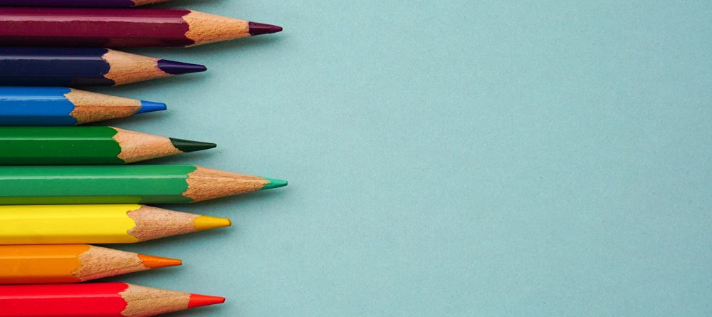
Colors are generally divided into two categories: warm and cool. The three warm colors are red, orange, and yellow, while the cool colors include green, blue, and purple. Each of these categories has its own characteristics, and if you want your photos to look their best, you should ask yourself which is more suitable for your work.
Warm colors carry more energy and evoke stronger emotions. They quickly grab the viewer’s attention. Generally, warm colors are rarer than cool ones, so a photo that contains a hint of warm color can stand out. That’s why sunrise and sunset shots, as well as autumn colors, are so popular.
This is a great insight for photography, especially in product and food photography, where color psychology plays a big role in how images attract and engage audiences.
Exploring the Emotional Impact of Colors in Photography
As you know, every color conveys a unique emotion to the viewer. Let’s examine the feelings associated with different colors in photography.
1. Red
Red is one of the rarest and most powerful colors in nature, making it highly significant for photographers. Due to its association with passion and excitement, it is unsurprising that red is a very active color. In some images, it can be quite intense—just a small amount of red can have a major impact.
To find red in nature, look for autumn leaves, red rock formations in places like the American Southwest, or sunsets. In other photography genres, such as portrait photography, be mindful that any red clothing worn by the subject will immediately draw the viewer’s eye. Red can also appear in makeup. In wildlife photography, red-toned subjects—such as the bright eyes of a tree frog or a crimson bird against snowy scenery—create striking compositions.

2. Orange – The Most Natural Color in Photography
Compared to red, orange is more commonly found in nature. It’s not just limited to sunsets—brown is a darker shade of orange and is always present in natural landscapes. Orange comes in different tones, from the deep brown of tree bark to the bright orange of pumpkins. While it conveys warmth, it is not as intense as red.
Orange is not a passive color; it attracts attention, especially when placed against a cooler background. To me, this color always carries a sense of adventure. If you’re interested in learning more about capturing sunset photos.

3. Yellow
Yellow is the brightest and most optimistic color, especially when used on its own rather than combined with orange or green. However, we often see it in mixed forms. Even vibrant green landscapes or orange sunsets contain traces of yellow.
On the other hand, if you look closely, you’ll notice yellow appearing independently in nature. Sand, autumn leaves, and even the sun at certain times of the day all feature bright yellow hues, making it an excellent choice for photographs that aim to convey positivity, energy, and excitement.
Like red and orange, yellow is a warm color and naturally draws attention. With careful observation, you’ll find ways to incorporate it effectively in your photos.
This is a fascinating insight, especially for product and food photography work. Yellow can play a big role in enhancing visual appeal, creating contrast, and evoking certain emotions.

4. Green – The Most Abundant Color in Photography Although blue is the most prevalent color in nature due to water and the sky, green is the color most closely associated with life. Our visual systems recognize green tones more than any other color. As a result, your photographs can feature deep green, light green, electric green, dark green, vibrant green, and many other variations.
Fundamentally, green is a familiar and calming color. Since it reflects living nature, it carries a sense of tranquility and appreciation for the outdoors. Among cool colors, green is the warmest.
5. Blue
One of the first people to write about the connection between color and emotions was Goethe, who stated in his 1810 Theory of Colors: “Blue draws us toward itself.” Modern perspectives haven’t changed much from this idea. Perhaps artistic tradition has overtaken reality in this regard, but there is an underlying truth to it—blue is directly associated with distance in the physical world.
Mist on the horizon and the blue sky both symbolize remoteness. Blue is not a chaotic color; it is calm and not overly radiant. In Instagram photography, an interesting fact is that blue-toned images, on average, receive more likes than warm-colored ones.
The reason is that red and orange are visually busy and difficult to interpret within a small frame, whereas blue doesn’t overwhelm or disrupt. Dark and light blue convey different emotions—deep blue can feel powerful and even unsettling, like storm clouds, while light blue is softer and more optimistic.

Color Harmony and Relationships in Photography
In addition to the fascinating film we presented about colors in photography, we want to emphasize that while individual colors are important, their relationships with one another are equally significant. This harmony ranges from the simplest color combinations to the most complex palettes, as the real world offers an unlimited variety of colors.
Some color relationships work better than others, although achieving the desired effect requires practice. Often, post-processing is necessary to refine the image and bring out the intended color harmony.


Leave a Reply